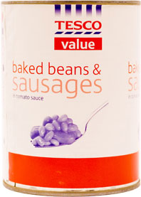
I really like the designs on Tesco's own-brand, low-budget basics 'Everyday' range. They're interesting and to me combine just the right mixture of cheapness (subtext: we're not spending a lot of money on the packages) but without being cheap (subtext: the working-class oiks most likely to buy this stuff have no design aesthetic).
Maybe the people at Tesco's have noticed that us oiks do have taste - or, more likely, they've noticed that the middle-classes are broke too and are as likely to be found shopping at Lidl's and Aldi's these days. For whatever reason, they've put some thought into the new look. Much better than their old designs which did look cheap and tatty. A real design vacuum. Hardly inspiring.
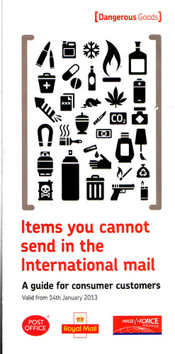
And I'm not the only one who likes the newer ones: introducing the Post Office's Everyday Dangerous Goods leaflet:
Not quite sure why you can't send snow through the post but I'm sure Lord MacPostOffice, or Amazon, or whoever owns it these days have their reasons.


2 comments:
I have no idea what a few of those items in the lower-right quadrant are. Under the box of CO2 there appears to be a Brundlefly telenport pod, a lampshade with a tassle and a rectangle with an 'X' on it, which I suppose could be some kind of symbolic representation of an X-Box (though I'm sure you can actually post those).
Are those beans purple on purpose?
Post a Comment