Showing posts with label Lidl. Show all posts

Monday, May 16, 2011


When I'm not staring at Lidl's packaging on the breakfast table trying to wake up in the morning, I occasionally find myself staring at Morrison's products with the same sense of bemusement. This milk carton for instance has been occupying my brain for some time now. (Or those portions of it functioning before the first coffee of the morning kicks in.)

The gate puzzled me for a long time, I spent ages trying to work out how you could make it in reality without the need for two dimensional planks - and why isn't it symmetrical? the joints where the diagonal meet the uprights are different top and bottom.

Then, for a while, I fretted over the typography.Why does 'From' get a capital letter when 'long life whole milk' doesn't? and, for that matter, why does the 'Fat' in '4% Fat' get one? Maybe capital F's were cheap that week.

Finally the other day I cracked what it was that was really annoying me. It's so obvious. It's the cows. The one on the in the distance left is the same cow as the larger, nearer one. It's just been cloned, flipped and shrinked a bit.

It probably goes "Oom!".

Wednesday, February 23, 2011

Fark me!

My obsession with the peculiarities of Lidl's graphic design team continues:

Ever since the days of clockwork computers, every desktop publishing package / graphics tool worth its salt has had the facility to rotate things. If you want two pieces of identical lettering going in opposite directions on different sides of something - like a wrapper for a bar of chocolate for instance - you would have thought that it would be simplicity itself to type the in text, copy it, paste it, rotate the copy, then move the two bits of text to where you want them.

Lidl's graphikers seem to have to type it all out every time. Maybe they had been naughty and ate the chocolate after the photoshoot instead of returning it to the shelves for sale and this was a punishment.


Sadly this typo has been fixed recently - this flattened packet has been in my scanner for weeks waiting for me to get round to doing this.

Tuesday, June 22, 2010

"It's very hard to get lipstick and nail varnish out of your belly button ..."

My unhealthy on/off, love/hate OCD-like relationship with Lidl's breakfast packaging continues:

Many moons ago I posted about the horribleness of this:

As you can probably tell from the above photo (taken with my usual skill on my trusty phone's crapo-cam) they have been re-jiggered. Not only is Goody Rice now known as Rice Snaps but the box has undergone a similarly radical rethink. The two Manga-lite yoofs characters remain but their super-untredy glovettes and bizarre radio-controller games console thing are gone. All they're doing now is just standing there. They're not even looking at the bowlful of product with the psychotic glee of all the other residents of Lidl's breakfast cereal packaging.

(It has just occurred to me that these two characters may have names and may even appear in a string of hilarious breakfast related adventures in some German children's comic - Das Beano or Der Dandy perhaps?)

The wonderfully sugar-stoned, radioactive soup dragon on the front of their Golden Puffs, on the other hand, is more than making up for their lack of interest. I think this creature is as fascinated as I am by the fact that the Golden Puffs floating about, mid-air in the foreground are way smaller than the ones lying in the bowl.


Maybe they swell up really fast as they absorb strange white semi-solid liquids, or maybe the front of the box was designed by the incompetent idiot who produced this handy pie chart of recommended daily food intakes on the back:


Starting at the top and working clockwise: 40% + 20% + 15% = 75%. Last time I looked 75% of something was three quarters - which means those three slices of pie should reach round to about halfway through the milk and cheese slice - whatever happened to the famed reputation for German precision?


Tuesday, May 25, 2010

A piece of Lidl packaging I like:


Formil Non-Bio washing machine tabs. Been keeping my family's clothes vaguely clean for years. I like this box not because its well-designed, or weird, or funny. I like it because it is exactly the right size to keep all those newspaper give-away 'free' DVDs I keep buying from charity shops at 20p a go.


I've got boxes full of them.

Sunday, May 23, 2010


My occasional obsession with Lidl's packaging has been annoying me again this week. In particular, their apple juice:


What is it with Lidl's graphic design team that they can't afford to buy fruit? Their old grape juice carton used to have a huge pile of Photoshop cloned grapes on the front. The same few grapes repeated over and over again - though since posting about it last October the packaging has been changed and now has what looks like a real bunch of real grapes on the front - is this a coincidence? Probably, but I like to think someone in Herr Lidl's vast megabunker 'somewhere in Germany' read my blog and swung into action.
"Scheiß! Someone has noticed! Get me Helmut and a crack team of cheap graphic designers here at the double..."
So, to the apple juice carton. Five apples. Five juicy apples. But let's look a little closer... *


If you look at it for more than a few moments it's incredibly obvious that top left apple and bottom right apple are the same piece of fruit - possibly the same photo - just reversed with some semi-convincing drops of Freshness implying liquid painted in and a leaf slapped on in a place no apple leaf would ever grow in real life. Same for the other diagonal pairing, a different same apple** - reversed. I suspect the apple in the centre of the group is the same as the first one as well, it's just been shot from a different angle - but even if it isn't I find it hard to believe that Lidl's couldn't find more than three photogenic apples in the whole of Europe. Makes you wonder what the ones they are squishing up and putting in the cartons look like.

To stop myself going crazy thinking about this sort of thing (what else is there to do in Lidl's?) I took a look at the This Week's Offer bins. Aha! Cans of expanding polyurethane foam. Useful stuff - under the right circumstances. Cheap too. 'Squeasy' is a bit odd but what sold me on buying some was the label telling me I had '360º use of the can'. Brilliant! I hate only having 270º use of the can or even if you get really cheap shit from the Pound shop 90º use of the can. What really really sold me though, was the fact that in some part of Europe I have yet to identify, expanding polyurethane foam is known as 'pu-skum'.


* Ooh! Yes, let's!

** I know what I mean.

Sunday, November 08, 2009

Everything in the World is Boring - Except Crumpets and Gnocci

Continuing my fascination with the weirdness of LIDL's graphic design team:


Tron?

And now I come to think of it, aren't complimentary things usually free? Defined as "given free as a courtesy or favour" by one online dictionary. So are you supposed to help yourself? And why doesn't 'food' deserve a capital letter?
I need to to get out more - except this is what I do when I do go out.

Maybe I should stay in more.

Saturday, October 24, 2009

As promised a few days back, here is another of Lidl's wonderfully strange cereal pockets.


I have no idea what this animal is supposed to be, is it a mongoose? a meerkat? a skinny red panda? Whatever it is supposed to be I have no idea why it appears so ecstatically eager to see a jugful of brilliant white emulsion paint being poured into a bowl of PseudoShreddies - and why is it wearing tartan braces? I mean this is one seriously deranged ferret here. I mean look at those rings around his eyes; this thing hasn't slept in a week. It doesn't need breakfast, it needs to go to bed! That or it thinks the white stuff being poured into the bowl is even more of the Columbian marching powder it's been stuffing up its nose for the past five days.

Why the tartan braces? Maybe it's the fifth (or probably sixth - I forget) Bay City Roller! Stig , the drummer they sacked in Hamburg. A cokehead psychotic Scottish mongoose reduced to posing for knock-off cereal packet covers. Why? Why would any product designer (even a German one) think this thing would sell breakfast foods to kids?

Monday, October 12, 2009

Another Public Service Posting


I shop at Lidl's.

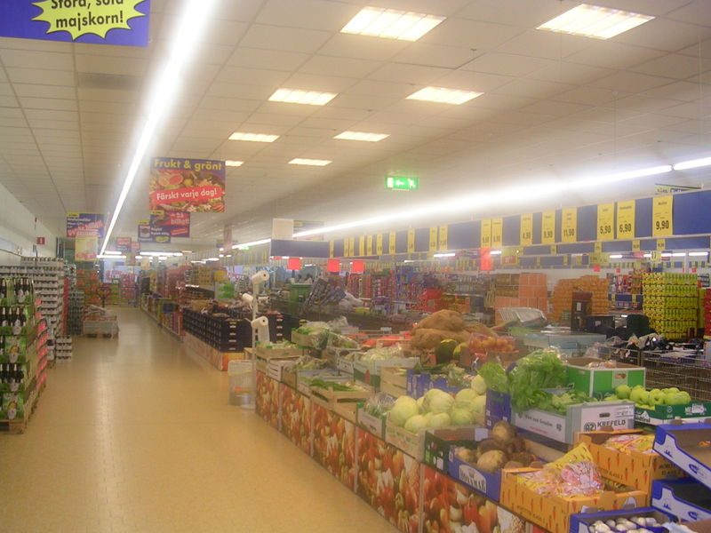
I'm not ashamed to admit it. Lidl's is cheap, doesn't play annoying musak at you while you shop and usually has the same things in the same places on the shelves most of the year round. They also have the best selection of fruit and veg in Fort William - which is a sad reflection on the Town which has spent years re-branding itself as the Outdoor Capital of the UK and succeeded to the point where the High Street has more winter sport clothing and mountaineering gear shops than most large cities.

There is precious little reason for any local to go down the High Street these days. 90% of the shops are either clothing shops of one kind or another (mostly Gortex stuff and hiking gear) charity shops, or pubs. It's insane that a town with a resident population of 10,000* has only two places to buy fruit and veg. Lidl's and Morrison's. Morrison's are crap. I have no idea what they do to their produce to make it rot so fast - sometimes fruit that looks perfectly good in the shop will have reduced itself to pulpy brown sludge by the time it's put in the fruit bowl a couple of hours later - and they vastly over package stuff. Shrink wrapped coconuts, that sort of thing. So that leaves Lidl. Which are not only cheaper but have real fruit and veg that hasn't been trimmed and wrapped in packs of six and quadrupled in price in the process. Sweetcorn 15p a cob, loose in a box, take as many as you want and if you want a bag go get one yourself. That sort of thing.

Right, rant over. To business.

Lidl also have some terrible package design. Just about everything in the shop is an 'own brand'. To disguise this fact and make the shoppers of Europe feel like they are browsing the shelves of a real shop with customer choice, teams of (presumably German) graphic designers have been beavering away for years making up faux brands to shove on the shelves of Lidls all over the continent.

Recently however they have either got themselves a new set of graphic designers, or started paying the the old ones more, because there seems to be a rolling design change affecting the store. All the labels are slowly being redone and improved. A lot of the old designs were great bits of Bad Art and need preserving before they are lost forever. Here are a couple of my favourites.


At first glance this carton of grape juice looks okay but after a few seconds it become apparent that the nice plump juicy grapes on the front are really clones. Look at the redder looking grape just under the Solvita logo, and then look at the grape lower down the carton next to the leaf on the left hand side. Same grape. Back to the top of the carton. See the two grapes to the right of the logo ... or the two to the left of the original one I pointed you at?
Lidl's graphic designers were working on such a tight budget they couldn't even afford a whole bunch of grapes to photograph!
"Helmut! What are you doing! Are you trying to ruin us! Take twelve of of them back and get a refund! We will Photoshop them. No one will notice ... "


Nothing too spectacularly dreadful here, no crappy Photoshoppery - apart from a bit of odd motion blur on the flying popcorn on the left - (presumably popcorn was cheaper than grapes) but it's the pseudo brand name that I find fascinating here. Charged with coming up with something quintessentially American, our crack team of Grafik-Designers came up with red, white and blue, stars and stripes, and the Statue of Liberty - three stripes and 171 stars, but who's counting?**. They also needed a name that would personify the USA - and thus was 'Mcennedy - American Way' born! 'Mcennedy'. It almost sounds right but isn't. It's like 'Kennedy' but ... isn't. It's just ... just ... wrong.

The Mcennedy 'brand' is stuck on anything vaguely non-ethnic 'American' in Lidl. To make it interesting sometimes the Statue of Liberty is holding her torch in her right hand (as above) and sometimes in her left ...


... forcing her to do a really weird back handed grip and probably dislocating her shoulder in the process. Poor old girl.

The breakfast cereals are a special treat though. Lidl's cereals - or at least the one we buy - are copycat clones of more famous and more expensive brands. This is the packaging for their version of Rice Crispies:


A bowl of motion-blurred, popping Rice Crispoids floating in that odd, super-white, non-wetting emulsion paint-like milk that only appears on the front of cereal packets, surrounded by a couple of weird Manga Lite Yoofyies doing 'hip' weird Manga Liteish things - like wearing gloves with only two fingers. I have stared at those gloves for years trying to work out why anyone, apart from an underpaid (possibly drunk) Grafiker who had once seen the back (or possibly front) cover of a Tokyo Mew Mew book, would think this could have been in any way, shape, or form, ever in the history of anything - 'cool'. Because that's what I think it's supposed to be. Cool.

"Hey mum look at the girl with the cool gloves on that cereal packet! "Can we have a packet of them, Mum can we, can we?"
These gloves have replaced The Flock of Seagulls haircut as the single most misguided attempt at 'coolness' in the history of Western culture.

Hmmmm, nice gloves ...


I'm going shopping in Lidl tomorrow so, unless they have replaced them already, keep your eyes on this space for the psychotic Scottish mongooses that appear on another of our regular purchases.


* It was 9,900 at the 2001 census - and god knows what the number gets up to at the hight of the summer tourist season but I would guess the population of the area will possibly double.

** Apart from me obviously.

Missing CD? Contact vendor

Free CD
Please take care
in removing from cover.

Copyright (c) 2004-2007 by me, Liam Baldwin. That's real copyright, not any 'creative commons' internet hippy type thing.

(this copyright notice stolen from http://jonnybillericay.blogspot.com/)

eXTReMe Tracker