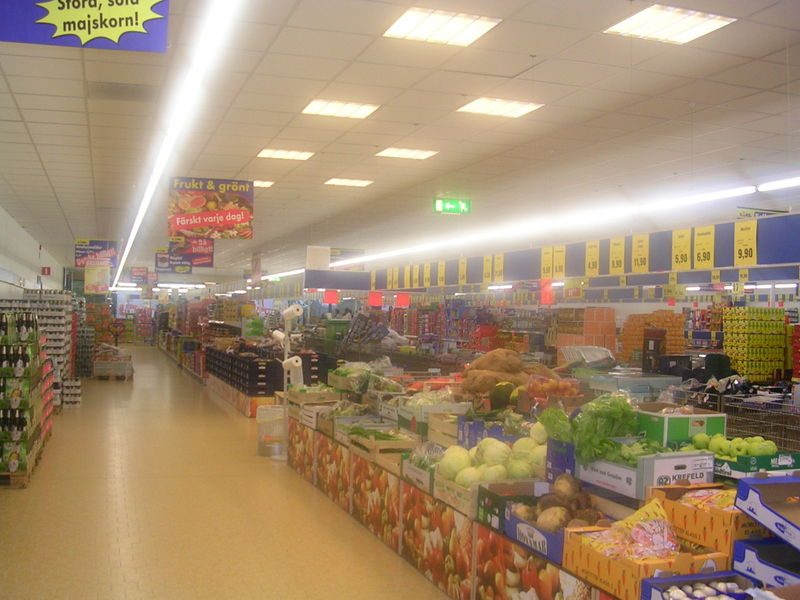
I shop at Lidl's.
I'm not ashamed to admit it. Lidl's is cheap, doesn't play annoying musak at you while you shop and usually has the same things in the same places on the shelves most of the year round. They also have the best selection of fruit and veg in Fort William - which is a sad reflection on the Town which has spent years re-branding itself as the Outdoor Capital of the UK and succeeded to the point where the High Street has more winter sport clothing and mountaineering gear shops than most large cities.
There is precious little reason for any local to go down the High Street these days. 90% of the shops are either clothing shops of one kind or another (mostly Gortex stuff and hiking gear) charity shops, or pubs. It's insane that a town with a resident population of 10,000* has only two places to buy fruit and veg. Lidl's and Morrison's. Morrison's are crap. I have no idea what they do to their produce to make it rot so fast - sometimes fruit that looks perfectly good in the shop will have reduced itself to pulpy brown sludge by the time it's put in the fruit bowl a couple of hours later - and they vastly over package stuff. Shrink wrapped coconuts, that sort of thing. So that leaves Lidl. Which are not only cheaper but have real fruit and veg that hasn't been trimmed and wrapped in packs of six and quadrupled in price in the process. Sweetcorn 15p a cob, loose in a box, take as many as you want and if you want a bag go get one yourself. That sort of thing.

Right, rant over. To business.
Lidl also have some terrible package design. Just about everything in the shop is an 'own brand'. To disguise this fact and make the shoppers of Europe feel like they are browsing the shelves of a real shop with customer choice, teams of (presumably German) graphic designers have been beavering away for years making up faux brands to shove on the shelves of Lidls all over the continent.
Recently however they have either got themselves a new set of graphic designers, or started paying the the old ones more, because there seems to be a rolling design change affecting the store. All the labels are slowly being redone and improved. A lot of the old designs were great bits of Bad Art and need preserving before they are lost forever. Here are a couple of my favourites.

At first glance this carton of grape juice looks okay but after a few seconds it become apparent that the nice plump juicy grapes on the front are really clones. Look at the redder looking grape just under the Solvita logo, and then look at the grape lower down the carton next to the leaf on the left hand side. Same grape. Back to the top of the carton. See the two grapes to the right of the logo ... or the two to the left of the original one I pointed you at?
Lidl's graphic designers were working on such a tight budget they couldn't even afford a whole bunch of grapes to photograph!

Nothing too spectacularly dreadful here, no crappy Photoshoppery - apart from a bit of odd motion blur on the flying popcorn on the left - (presumably popcorn was cheaper than grapes) but it's the pseudo brand name that I find fascinating here. Charged with coming up with something quintessentially American, our crack team of Grafik-Designers came up with red, white and blue, stars and stripes, and the Statue of Liberty - three stripes and 171 stars, but who's counting?**. They also needed a name that would personify the USA - and thus was 'Mcennedy - American Way' born! 'Mcennedy'. It almost sounds right but isn't. It's like 'Kennedy' but ... isn't. It's just ... just ... wrong.
The Mcennedy 'brand' is stuck on anything vaguely non-ethnic 'American' in Lidl. To make it interesting sometimes the Statue of Liberty is holding her torch in her right hand (as above) and sometimes in her left ...

... forcing her to do a really weird back handed grip and probably dislocating her shoulder in the process. Poor old girl.
The breakfast cereals are a special treat though. Lidl's cereals - or at least the one we buy - are copycat clones of more famous and more expensive brands. This is the packaging for their version of Rice Crispies:

A bowl of motion-blurred, popping Rice Crispoids floating in that odd, super-white, non-wetting emulsion paint-like milk that only appears on the front of cereal packets, surrounded by a couple of weird Manga Lite Yoofyies doing 'hip' weird Manga Liteish things - like wearing gloves with only two fingers. I have stared at those gloves for years trying to work out why anyone, apart from an underpaid (possibly drunk) Grafiker who had once seen the back (or possibly front) cover of a Tokyo Mew Mew book, would think this could have been in any way, shape, or form, ever in the history of anything - 'cool'. Because that's what I think it's supposed to be. Cool.
 Hmmmm, nice gloves ...
I'm going shopping in Lidl tomorrow so, unless they have replaced them already, keep your eyes on this space for the psychotic Scottish mongooses that appear on another of our regular purchases.
* It was 9,900 at the 2001 census - and god knows what the number gets up to at the hight of the summer tourist season but I would guess the population of the area will possibly double.
** Apart from me obviously.
I'm not ashamed to admit it. Lidl's is cheap, doesn't play annoying musak at you while you shop and usually has the same things in the same places on the shelves most of the year round. They also have the best selection of fruit and veg in Fort William - which is a sad reflection on the Town which has spent years re-branding itself as the Outdoor Capital of the UK and succeeded to the point where the High Street has more winter sport clothing and mountaineering gear shops than most large cities.
There is precious little reason for any local to go down the High Street these days. 90% of the shops are either clothing shops of one kind or another (mostly Gortex stuff and hiking gear) charity shops, or pubs. It's insane that a town with a resident population of 10,000* has only two places to buy fruit and veg. Lidl's and Morrison's. Morrison's are crap. I have no idea what they do to their produce to make it rot so fast - sometimes fruit that looks perfectly good in the shop will have reduced itself to pulpy brown sludge by the time it's put in the fruit bowl a couple of hours later - and they vastly over package stuff. Shrink wrapped coconuts, that sort of thing. So that leaves Lidl. Which are not only cheaper but have real fruit and veg that hasn't been trimmed and wrapped in packs of six and quadrupled in price in the process. Sweetcorn 15p a cob, loose in a box, take as many as you want and if you want a bag go get one yourself. That sort of thing.
Right, rant over. To business.
Lidl also have some terrible package design. Just about everything in the shop is an 'own brand'. To disguise this fact and make the shoppers of Europe feel like they are browsing the shelves of a real shop with customer choice, teams of (presumably German) graphic designers have been beavering away for years making up faux brands to shove on the shelves of Lidls all over the continent.
Recently however they have either got themselves a new set of graphic designers, or started paying the the old ones more, because there seems to be a rolling design change affecting the store. All the labels are slowly being redone and improved. A lot of the old designs were great bits of Bad Art and need preserving before they are lost forever. Here are a couple of my favourites.

At first glance this carton of grape juice looks okay but after a few seconds it become apparent that the nice plump juicy grapes on the front are really clones. Look at the redder looking grape just under the Solvita logo, and then look at the grape lower down the carton next to the leaf on the left hand side. Same grape. Back to the top of the carton. See the two grapes to the right of the logo ... or the two to the left of the original one I pointed you at?
Lidl's graphic designers were working on such a tight budget they couldn't even afford a whole bunch of grapes to photograph!
"Helmut! What are you doing! Are you trying to ruin us! Take twelve of of them back and get a refund! We will Photoshop them. No one will notice ... "

Nothing too spectacularly dreadful here, no crappy Photoshoppery - apart from a bit of odd motion blur on the flying popcorn on the left - (presumably popcorn was cheaper than grapes) but it's the pseudo brand name that I find fascinating here. Charged with coming up with something quintessentially American, our crack team of Grafik-Designers came up with red, white and blue, stars and stripes, and the Statue of Liberty - three stripes and 171 stars, but who's counting?**. They also needed a name that would personify the USA - and thus was 'Mcennedy - American Way' born! 'Mcennedy'. It almost sounds right but isn't. It's like 'Kennedy' but ... isn't. It's just ... just ... wrong.
The Mcennedy 'brand' is stuck on anything vaguely non-ethnic 'American' in Lidl. To make it interesting sometimes the Statue of Liberty is holding her torch in her right hand (as above) and sometimes in her left ...

... forcing her to do a really weird back handed grip and probably dislocating her shoulder in the process. Poor old girl.
The breakfast cereals are a special treat though. Lidl's cereals - or at least the one we buy - are copycat clones of more famous and more expensive brands. This is the packaging for their version of Rice Crispies:

A bowl of motion-blurred, popping Rice Crispoids floating in that odd, super-white, non-wetting emulsion paint-like milk that only appears on the front of cereal packets, surrounded by a couple of weird Manga Lite Yoofyies doing 'hip' weird Manga Liteish things - like wearing gloves with only two fingers. I have stared at those gloves for years trying to work out why anyone, apart from an underpaid (possibly drunk) Grafiker who had once seen the back (or possibly front) cover of a Tokyo Mew Mew book, would think this could have been in any way, shape, or form, ever in the history of anything - 'cool'. Because that's what I think it's supposed to be. Cool.
"Hey mum look at the girl with the cool gloves on that cereal packet! "Can we have a packet of them, Mum can we, can we?"These gloves have replaced The Flock of Seagulls haircut as the single most misguided attempt at 'coolness' in the history of Western culture.
 Hmmmm, nice gloves ...
I'm going shopping in Lidl tomorrow so, unless they have replaced them already, keep your eyes on this space for the psychotic Scottish mongooses that appear on another of our regular purchases.
* It was 9,900 at the 2001 census - and god knows what the number gets up to at the hight of the summer tourist season but I would guess the population of the area will possibly double.
** Apart from me obviously.


No comments:
Post a Comment